Does your practice focus on working with an older folks? Patients, caregivers, adult children… If your work or marketing targets people over the age of 50 or 55, then this tip is for you.
Because… you may be sending them away without even realizing how or why – or importantly – what you can do instead.
Here’s why:
I’m old – at least in body (certainly not in spirit!) I’m really a young sort of old, but I’m past retirement age if that gives you a clue.
I struggle with my vision. I’ve worn glasses since I was 9 years old (including decades of contact lenses, of course). Believe me, my eyes have only gotten worse over the years. But that’s not at all unusual. It’s normal aging.
I don’t worry about it. But I’m often frustrated by it.
Your target audiences may be frustrated by it, too. And if you aren’t taking steps to make things easy for them to read – especially your marketing – you may be losing their business.
Here are some examples of how this plays out, and what to do instead:
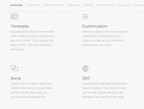
Websites: I see gorgeous, but totally impossible to read, websites regularly. These are beautiful, but almost non-functional or practical, websites put together by professionals who don’t know diddly-squat about how to design for older eyes. When I see a website like that, then I know the owner has no interest in my business. If he or she was interested, they would have made it much easier for me to read.
- The type is too tiny, making it difficult to read. (Fonts / typesizes should be at least 14px/12pt. For comparison purposes, the text on this site is 16px.)
- The type is too light in color. It’s gray, even dark gray, but not black. That means there isn’t enough contrast making it difficult to distinguish the type from the background.
- The background is too dark /not enough contrast. I even see this in email “stationery” – where someone wants to make their email or web look “cool” by using an unusual color – creating a problem for those who have trouble with vision.
- There is too little white space, meaning, text runs together. There should be whitespace between paragraphs, between lines, between text and images, etc. The worst example of this is phone numbers that haven’t been separated to make them look like phone numbers. Example: 3524598889 Why not write it in a phone format making it easier to read? 352-459-8889 or (352) 459-8889 ?
- Colors can be too bright. Now, I love bright colors! And the contrast between bright – darker colors is good. But if you serve me a bright pink or a bright yellow against a white background, I have to leave your site. It hurts my eyes.
- Finally – the same advice holds true for other marketing – the AdvoConnection Directory (good grief the number of people who violate the phone number problem!), other directories, even print materials like brochures or business cards.

Now – if your target audience is much younger – say 50 or younger – then feel free to ignore this tip. However, most of us advocates and care managers do work with, and want to continue working with, seniors – people with aging eyes.
These are just some examples of the ways you may be standing in the way of your own success; sending away the very people you want to work with.
Take a look at your marketing and see how you can make it more readable and useful for your target audience!
Like PUP! TIPS?
Subscribe to find a new tip in your inbox twice a month! Sign Up for TIPS

